
BrainStation Industry Project — Winner
Toronto Open Data
Presenting datasets in a valuable way for both the city bureaucracy and general public
Project Brief
timeline 🗓️
24 hours
tools 📝
Figma
Canva
marker and paper
my role 👩🏻
UX researcher
UX/UI designer
presenter
my team 👩🏻🤝👨🏽
2 UX designers
2 data scientists
3 software engineers
1 project manager
In 24 hours, show us how you and your group can present Open Data in a valuable way to both city bureaucracy and the general public… 3, 2, 1, go!

The City of Toronto has this amazing open-source information delivery tool that can provide anyone with the datasets they need to explore or accomplish their goals.
So why don’t more people know about Open Data?
In fact, the only person I knew, who knew about Open Data, was a friend who used to be a data scientist for the City of Toronto, coincidentally enough. But Open Data is open to anyone to use, not just data scientists: app developers, researchers, interested citizens, concerned citizens… the list goes on.
Thus, our work began with this initial How Might We question:
How might we present Open Data in a valuable way to both city bureaucracy and the general public?
1/ Research
With this question in mind, my team and I began our brainstorming. First, we had to decide which dataset to focus on. We hijacked six whiteboards and wrote our ideas and justifications for the datasets we wanted. Since our software engineers were only able to work with JSON files, we narrowed down our search to datasets that were available in that format.
We ended up picking the dataset with the longest name known to man, Daily Shelter & Overnight Service Occupancy & Capacity. We believed it was the best choice because it contains information that is inherently valuable to both the city and public, so now we just had to figure out how to present it.
Our dataset now chosen, we revised our HMW question to be more precise:
How might we present the “Daily Shelter and Overnight Service” dataset in order to inform the city and general public about how to better support people in need?
In order to understand the importance of this dataset, we did some secondary research and received some key metrics about homelessness from our data scientists:
98%
occupancy rate of Toronto shelters every night¹
9000+
people without housing every night¹
61
shelters in the city²
But I think everyone can already agree that homelessness is a huge issue in Toronto; I don’t think I need to sell you on those numbers. What, then, are we going to do about these stats?
This led us to the foundation of our work.
In order to leverage the dataset to help this vulnerable population, we created a persona and simplified task flow for a person we believe would benefit from using Open Data.
2/ Persona
Say hello to Natasha, a 38-year old social worker living in Toronto, whose main clients tend to rely on the city’s shelter system. She strives to help them find a secure place to sleep.
Click image to enlarge
However, Natasha has notable pain points. If you look closely, you’ll notice that she has multiple struggles with Open Data, namely that using it is time-consuming, the interface is frustrating, and she is prone to errors due to the unintuitive navigation.
We authored a simple task flow that shows how she would normally access Open Data, but at the fourth step, she is blocked from continuing her work. The Open Data interface is just so complicated and confusing, especially for someone like her who doesn’t have a data background and doesn’t understand the data files, that she can’t effectively support her clients.
3/ Task Flow
Once we knew the task, I sketched a couple of potential design solutions that we could implement. We knew we wanted to keep Open Data as a webpage since that is how users usually access it, so that helped to guide my layout.
4/ Sketches & Branding
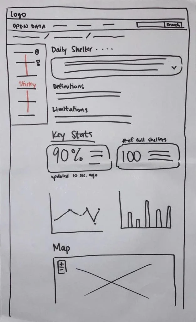
Second iteration of potential webpage layout
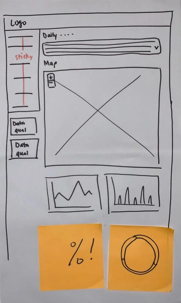
First iteration of potential webpage layout
Time to turn those sketches into digital wireframes! Since we were designing for Toronto Open Data, we made sure to stay within the visual parameters of the brand. We wouldn’t want visitors to the site to get confused about why this page suddenly looked different from previous pages. This meant utilizing the same colours, typography, and layout as the current Open Data site.

And with the time crunch we were under, we went straight into high fidelity wireframes. We wanted to deliver the finished wireframes to our developers by midnight, so that they would have enough time to implement their code.
So without further ado… ➡️
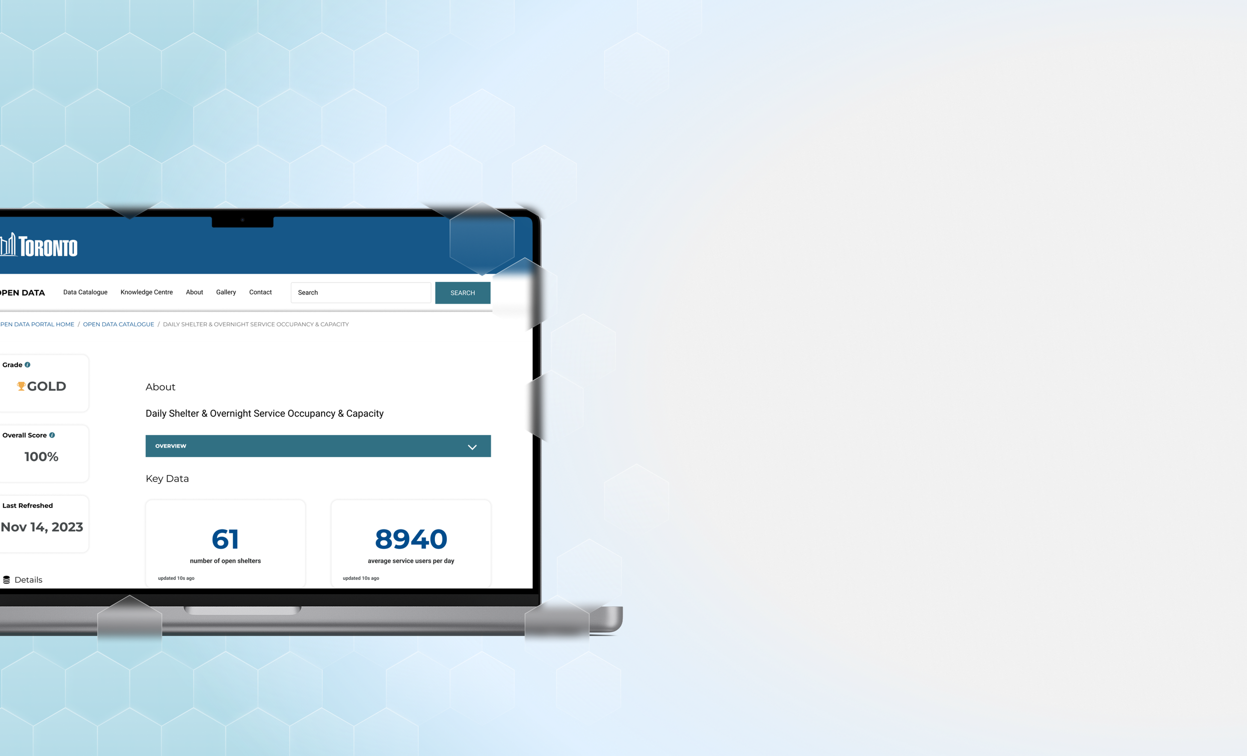
5/ Final Deliverable

Here’s how our improved design compares to the actual Open Data webpage:
CURRENT
OUR UPDATE
Did we answer our HMW question and help Natasha?
Here’s a quick refresher:
How might we present the “Daily Shelter and Overnight Service” dataset in order to inform the city and general public about how to better support people in need?
Natasha is a social worker who relies on Open Data to find information to help her clients find places to stay overnight, but struggles with understanding the website’s interface and meaning of the data, effectively preventing her from helping her clients when they need her the most.
We definitely didn’t solve the problem of homelessness in Toronto, but I think we answered the question we set out to answer 24 hours ago. Here’s how:
Pushed data quality metrics to the top of the left sidebar. It’s important for Natasha to know and easily glimpse how up-to-date and comprehensive the dataset is, so she can save time for her clients.
Minimized the About section into a dropdown menu. The average person, like Natasha, will not want to read all that information, so we hid it. It’s still easily accessible for anyone who would want to know.
Visualized key data. The most crucial change. By providing significant numbers, graphs, and a map, Natasha can quickly get an idea of what information this dataset was obscuring. The big numbers provide the most important facts from the dataset; the graphs provide a visualization of some data that is easier to comprehend than just reading columns of data; and the map allows users to search for any shelter location. City officials can also use this information to get a better understanding of how to fund and support shelters.
After all that, we were finally able to hand off our finished wireframes to our devs, who spent all night coding our final masterpiece. There were a few tweaks in the visual design, but they don’t interfere with the user experience.
Watch a short demo of our solution below:
6/ Future Thinking
Planned revisions
live update the numbers so users are always aware of any changes
colour-code map markers so that users can see which shelters are full, busy, or not busy
personalize the graphs for each dataset on Open Data
Important insights
it was a challenge to work on a multidisciplinary team, where each department had different goals and levels of expertise, but also rewarding when we were able to come together to solve our problem
time is of the essence—I set timelines and made sure everyone was on track
I learned a lot about myself as a person and designer, and how I generally deal with conflict resolution. This eye-opening experience reinforced my strengths in being neutral and understanding
Snapshots
〰️
Snapshots 〰️
That’s all folks!
That’s the end of my Open Data case study! Thank you so much for taking the time to go through it. Feel free to explore my other case studies or send me a message if you have any questions. 👋🏻