

Heuristic Evaluation
Cineplex
Evaluating the Cineplex iOS app according to the ten UI heuristics
Project Brief
timeline 🗓️
2 weeks
tools 📝
Figma
Canva
my role 👩🏻
Heuristic evaluator
UX/UI designer
presenter
my team 👩🏻🤝👨🏽
4 UX designers
0/ But wait, what’s a heuristic evaluation anyway?
Good question! A heuristic evaluation is a method for finding usability problems in a user interface design, such as an app or website. The interface is judged against ten recognized usability principles, known as “heuristics”, and whether or not they successfully follow those principles.
Here is a simple poster listing out the ten heuristics by Jakob Nielsen, co-founder of Nielsen Norman Group and co-creator of the most widely-used heuristics to improve UI design.
Source: NN/g
1/ Not all heuristic infractions are created equal
A severity rating is important to help us understand which heuristic problems to prioritize and focus our resources on. Each rating considers a combination of the frequency, impact, and persistence of the problem at hand. Below you can see the rating on a scale of 0-4, with 0 being not a problem at all, and 4 being a usability catastrophe.
2/ Cineplex, we have a problem
Recently (September 2023), Cineplex decided to revamp their iOS app. Usually, updates are well-received, but this one ignited tons of disgusted reviews. In fact, 70.5% of the reviews regarding the update were negative, and prior to that, there had been no app reviews for the past two years.
The app currently sits at a 3.0/5 with 221 ratings (December 11, 2023).


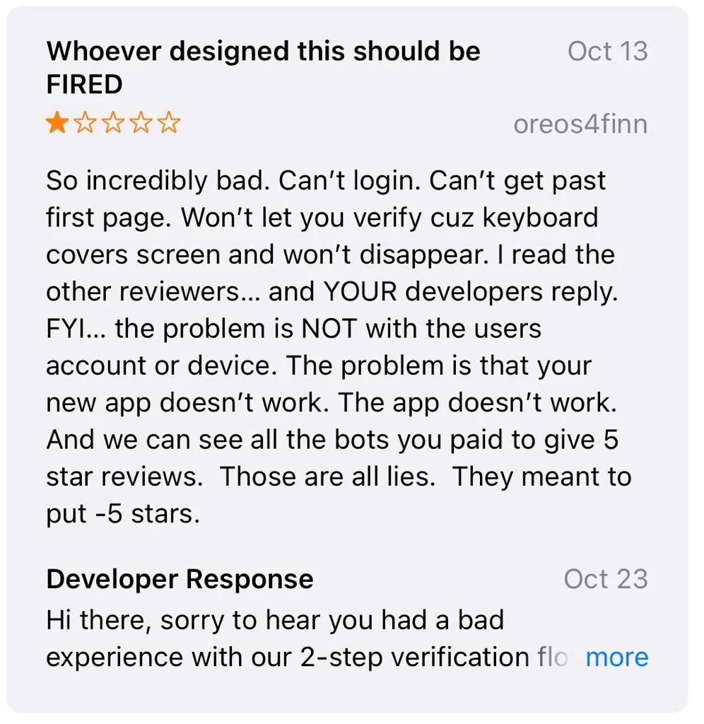
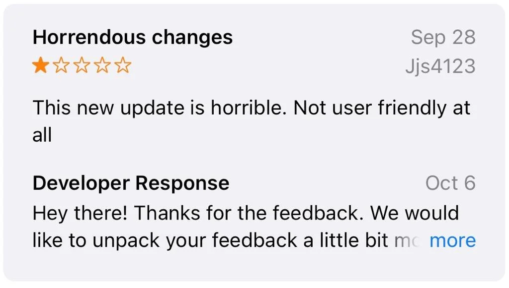


So… yeah… a lot of people were (and still are) angry 😡, especially regarding the user interface. This app that is supposed to help users find showtimes and buy movie tickets for Cineplex theatres clearly wasn’t working, so my team and I decided to tackle this problem. We all like to watch movies, right?
3/ I gotta be the user!!!!
To get started, I created a task flow of how a user would go through the Cineplex app to buy a movie ticket.
Once the task was understood, my team and I put ourselves in the shoes of the user to see where, along that task flow, the user interface was failing heuristic guidelines. We got quite captivated by this roleplay and oftentimes we were genuinely so frustrated by the design that we had no idea how this app even got the green light. 😤
⬇️ Keep on scrolling to see these screens in action ⬇️
Next, we used a design priority matrix to organize which problems we would focus on. We only wanted to focus on problems that would have a high impact on our users. Low effort problems to solve were initially prioritized, but we decided to expand to all high effort problems when we knew we had the time.
4/ I knew you were trouble when I logged in…
During our first round of heuristic application, my team and I made some mistakes regarding which heuristic to apply, and the severity of the heuristics. We were also starting to confuse UX problems for UI problems. While both are important, heuristics only apply to UI issues. Fortunately, with feedback from our educators and after reviewing with each other, we corrected the heuristics and severity ratings for our five proposed design changes.
Here are the screens we noted high-impact, low-effort heuristic problems on, for when a user is trying to purchase a ticket to the Taylor Swift The Eras Tour movie. They extend from the homepage all the way to the ticket purchasing page.
#4: Consistency and Standards

Button below movie carousel is misleading to users
#2: Match between System and the Real World

Recently searched theatres are automatically saved as favourite theatres
#7: Flexibility and Efficiency of Use

No filter to narrow down theatre or movie search results
#5: Error Prevention

Back arrow chucks users all the way back to showtime selection page, forcing them to redo the payment
#4: Consistency and Standards

Inconsistent UI aesthetic with other screens questions brand identity and credibility
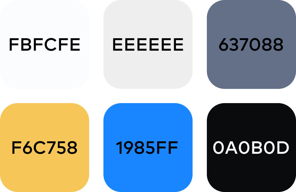
5/ Constraints, you couldn’t ignore me if you tried
Before we could even start making the design changes, we assessed the app’s typography, colour palette, and brand voice to ensure any changes we did make would match the look of the app. We also looked at the 2010 Cineplex Brand Guidelines for more information. These visual constraints helped us maintain Cineplex’s brand identity across the entire app.
Typography
Colour
Voice


6/ Here’s changes!
🌟 With our priorities and constraints confirmed, we applied our design changes to solve the five heuristic problems we found 🌟

Homepage: Consistency and Standards
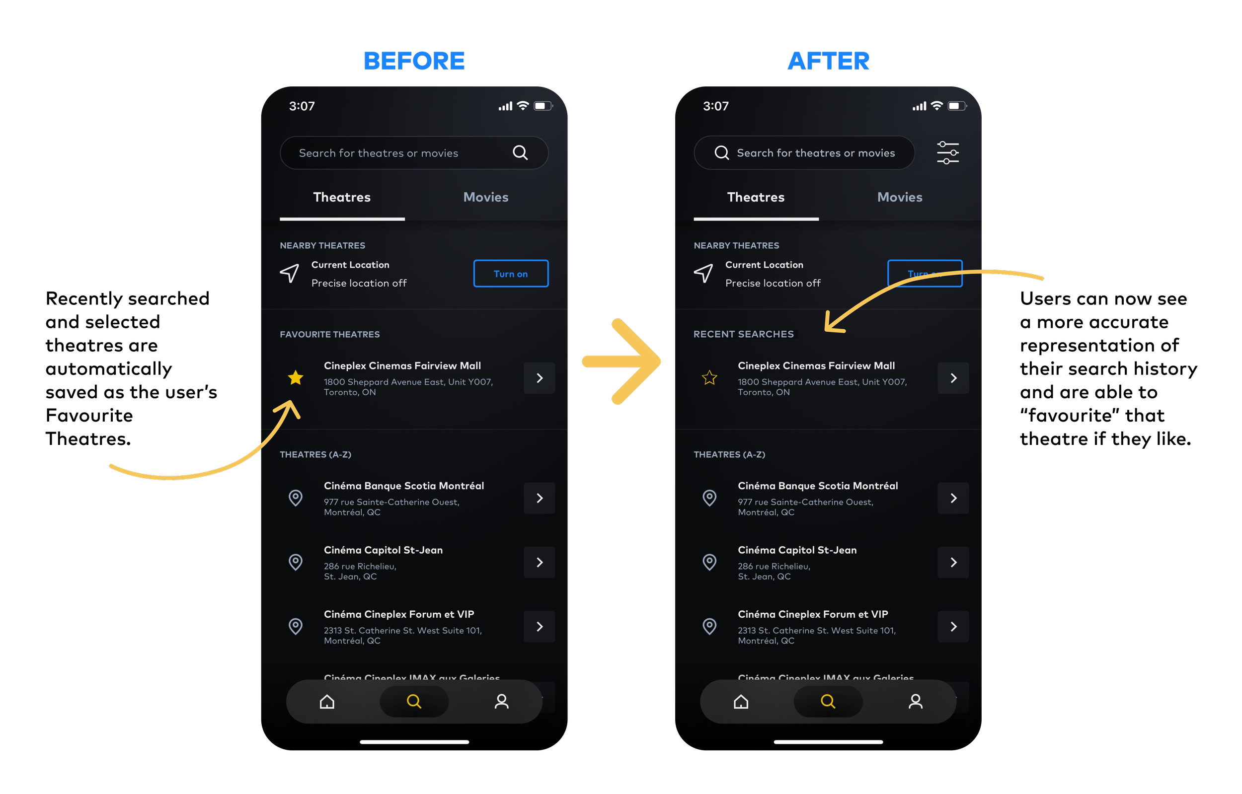
Search Theatres: Match between System and the Real World

Search Movies: Flexibility and Efficiency of Use
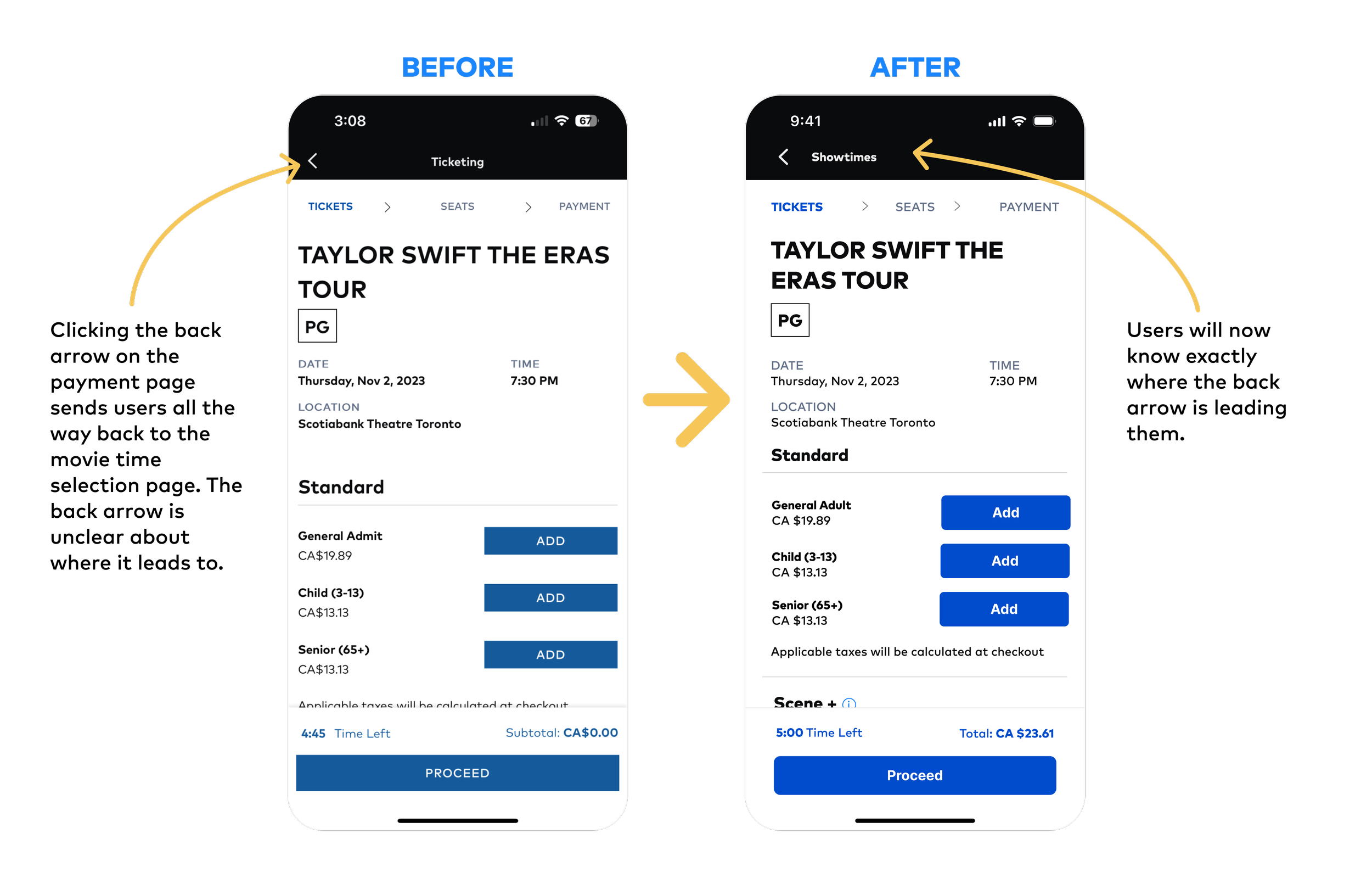
Ticketing: Error Prevention
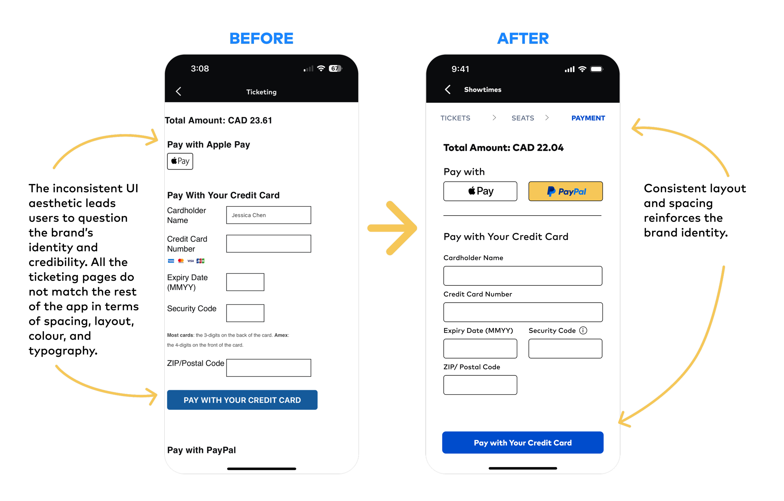
Payment: Consistency and Standards
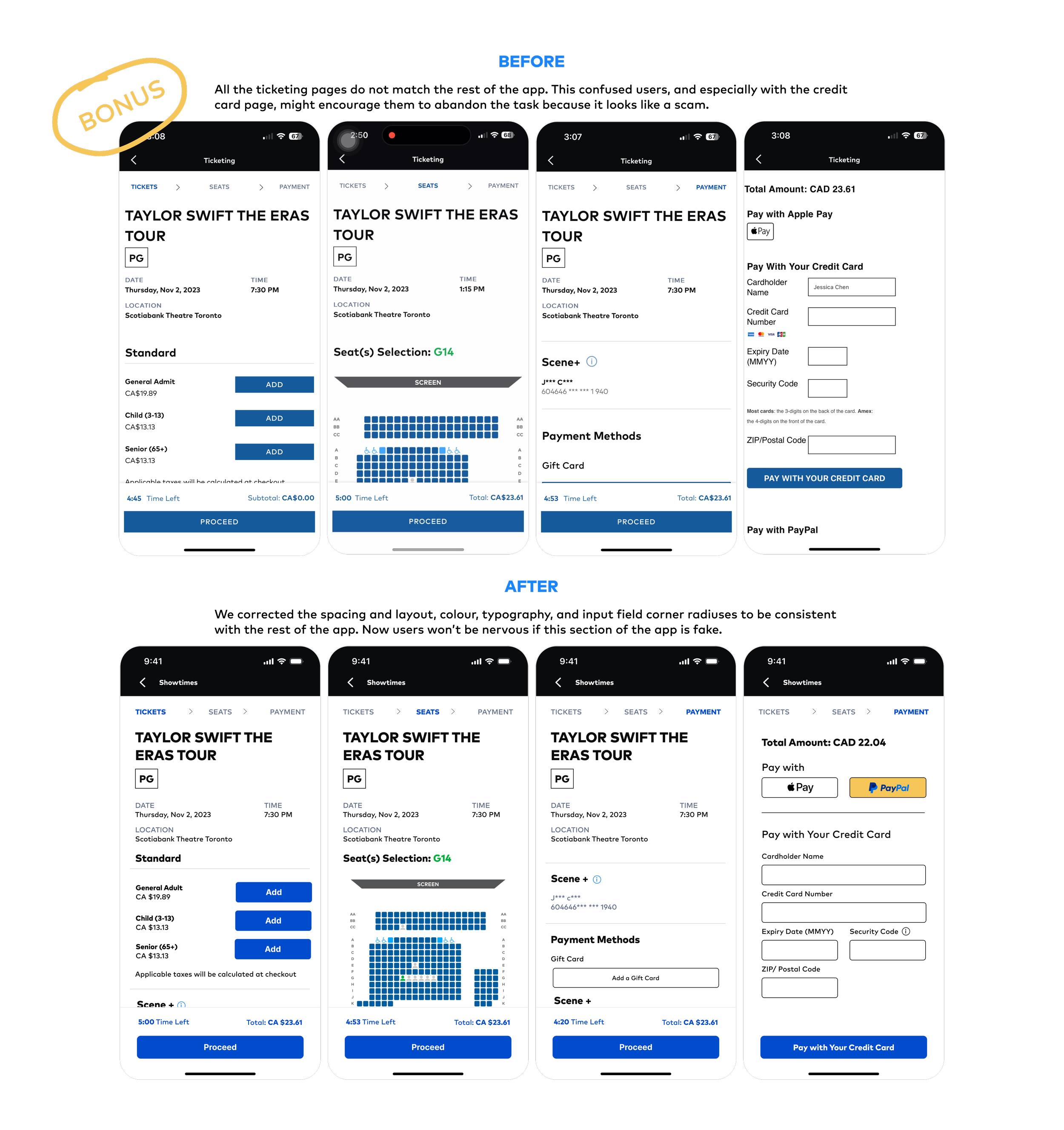
All Ticketing: Consistency and Standards
7/ But what I do have are a very particular set of learnings
This was my first time hearing about and applying heuristic principles to a UI design. It was definitely a very challenging task because I was confused by the meanings of some of the heuristics, and some of them were difficult to understand without concrete examples. But now, I can’t help but look for heuristic issues in the interfaces I use daily. I’m surprised by the amount of problems I find in popular apps and sites!
I also learned an important distinction between UI and UX problems. My team and I kept finding what we thought were UI problems, but in fact were UX problems. This really messed with our brains and led to stalemates when we couldn’t figure out which heuristic applied to the problem, or whether the problem even warranted a heuristic.
We were also so dead set on ensuring each heuristic and rating was “right” that we often couldn’t come to an agreement. It wasn’t until later that we realized that it’s not so much important that the heuristic is correct, but that we could defend and prove our decisions. With these in mind, we successfully justified our choices before a mock Cineplex board of directors and had fun while doing it. 🙂
P.S. Did you catch all the pop culture references in each title? 🎬
That’s all folks!
That’s the end of my Cineplex case study! Thank you so much for taking the time to go through it. Feel free to explore my other case studies or send me a message if you have any questions. 👋🏻