

Capstone Project
speakeasy
An iOS language learning app for people who want to have better conversations
Project Brief
timeline 🗓️
10 weeks
tools 📝
Figma
Artboard Studio
MS Office
marker and lots of paper
my role 👩🏻
UX researcher
UX/UI designer
Project manager
0/ Background
my personal experience >
When I was an English instructor in Japan, I had heard many complaints from students about how difficult it was to practice their English speaking skills in a country with few fluent speakers. This fact was further proven to me when I would frequent my favourite restaurant after class, and the owner (who actually spoke fluently since he lived in Germany for 5 years) would encourage all the staff and customers to speak with me, so I could teach them more.
After I moved back to Canada, I didn’t want to forget about them and their desire to learn another language.
That’s how I came up with Speakeasy.
1/ Empathize
actual stats >
According to a 2023 survey conducted by Preply, an online language learning platform, not knowing (and not being able to learn) a second language is wholly disadvantageous and affects people in all spheres of their lives. But don’t just take my word for it—see the stats for yourself:
21%
of language learners stopped studying because they lacked the opportunity to practice
21%
have missed a career opportunity because they didn’t know a second language
58%
of people are embarrassed by their inability to talk to others in another language
Source: Preply
human-centred design >
IDEO defines human-centred design as one way to creatively approach problem solving. It starts with the people you’re designing for and ends with solutions that are tailored just for them. As you will see in this case study, I accomplished this process by conducting interviews and developing personas, designing task flows and digital screens, testing with users, and creating prototypes and unique branding. This all comes together to form a cohesive solution for the people I’m designing for.
conducting interviews >
After getting my secondary research, I started gathering more information by conducting three interviews to understand why Torontonians learn another language, what barriers they face, and what they enjoy about it.
“I want to make others happy when they hear me speak their language.”
- Emily

“Speaking is more difficult than reading because it’s hard to say things the way I have it in my head.”
- James
“I want to learn Japanese to get closer to my daughter-in-law's parents.”
- Grace

3/ Define
affinity map >
After interviewing, I collected all my key notes, then analyzed and organized them in an affinity map to better visualize a potential design intervention to help language learners practice speaking. Data points were also filtered into goals, motivations, behaviours, and pain points. Then I organized key data points from each of the interviewees into overarching themes and insight statements.
chosen theme >
After going through the affinity map, the theme I decided on was:
Communicate with Others 🗣️
Interviewees want to practice speaking a language so they can talk to others they see often.
This theme represented the largest problem my interviewees were facing and aligned with my research findings.
HMW >
Based on the theme, I authored a How Might We. This is the most important question of my design process. How Might We is used to understand the problem of the user and how we as designers can help solve it.
How might we help learners practice speaking in order to talk to their friends and community members more often?
Now that I have a question to answer, I used that to figure out who I want my users to be. I consolidated my interview data, chosen theme, and HMW to create a persona and experience map. This helped me keep the persona’s problems in focus.
persona & experience map >
user stories >
Mei is an older adult, retired and living in Toronto, who wishes to speak with others more in their native language, but struggles to study well and find a speaking partner. When she tries to study on her own, at first she feels excited and hopeful, but she progressively starts to feel overwhelmed, stressed, and frustrated by the difficulty of learning alone.
Mei Wong
Speaking 📢
As a language learner, I want to speak with the correct vocabulary, so that I’ll sound more like a native speaker.
This epic answers Mei’s problem. Considering that her main goal of language learning is to be able to speak to native speakers, she needs to be able to converse like them so that she can be understood, and that requires using the correct words and phrases.
After figuring out the opportunities for design intervention to help Mei as noted in her experience map, I created 29 user stories to ideate potential functionalities for the upcoming digital solution. Then, I organized these user stories into three epics (functional groupings) to decide the overall purpose of the app, and focused on the most relevant one:
task flow >
The aim of my task flow is to use audio recording to help Mei accomplish her goal of sounding like a native speaker and to achieve the user story of learning vocabulary, in the fewest steps possible. If Mei were interacting with my digital product, this is the sequence of tasks she would perform.
4/ Ideate
UI inspiration board >
sketches >
greyscale wireframes >
With an idea of what my task flow required, I started grabbing design inspiration from real-world examples and works from other designers, to see what drives a product similar to mine. I visually audited seven other language learning apps to understand what I wanted to incorporate for my design, and organized everything into a UI inspiration board.
I can finally start sketching! I drew three exploratory sketches per screen (from my task flow) to get a rough idea of what I could include. After, I analyzed all the layouts and picked the ones with the most potential in terms of benefits for Mei, I redrew and annotated them for neatness.
After I had my official low fidelity paper wireframes, I was ready to translate them into digital greyscale wireframes, so that I could start my two rounds of user testing.
5/ Test
user testing >
I conducted two rounds of user testing with ten users in total to see what was working and what needed to be changed about my design. After each round, I organized the design changes into a design prioritization matrix, where I focused on changes that would be a low effort for me to accomplish but have a high positive impact on my users. If I saw that I had the time, I also completed design changes that were low effort and low impact.
-
Add English translation to phrases
Highlight Chapter 1 card
Move “play” and “record” buttons lower on the screen
Enlarge “Save recording” button
Add “close” button to pop-ups
Enlarge “play” button on saved recordings page
-
Name topic cards
Rename “Getting Around” to be clearer
Name chapter cards
Change chapter triangle icons to be clearer
Fade out chapters after Chapter 1
Reword “practice this phrase” button
Shrink “practice this phrase” button
Change iOS modal to app-specific modal
Rename “See all recordings” to be more inclusive
Add a filter to saved recordings
Add English translation to saved recordings
6/ User Interface
moodboard >
It was a lot of effort to get here, but I can finally start working on my visual identity and brand development. Here, I decided on my colours, typography, voice, and other design elements to really strengthen my project. To accomplish this, I created a moodboard, discovered adjectives I wanted my brand to embody, and did accent colour exploration.
colour psychology >
wordmark exploration >
icon exploration >
Yellow represents happiness, warmth, and intellect, but too much of it can cause anxiety, so it was used only for accents.
Blue represents trust, calmness, inspiration, and wisdom, but dark blues like navy are boring, so I used a richer cerulean.
After landing on my app name, Speakeasy, I brainstormed various wordmark ideas. From a competitive analysis to font psychology (serif or sans-serif?), I explored a multitude of pathways.
Because I was designing for iOS, I worked on creating my icon for mobile viewports. I sketched a bunch of potential ideas, then got feedback from my peers for my final decision.
I decided on making my chosen app icon the golden yellow accent colour, so that it would stand out on a user’s home screen. The other iterations I had considered were too dull.


I decided on this wordmark because I liked the playfulness of the curvy line, and the separation of “speak” and “easy” makes it easier for users to understand the meaning of the app. This design looked the most unique to me–I want to stand out from my competitors–while also being clean, simple, and readable.

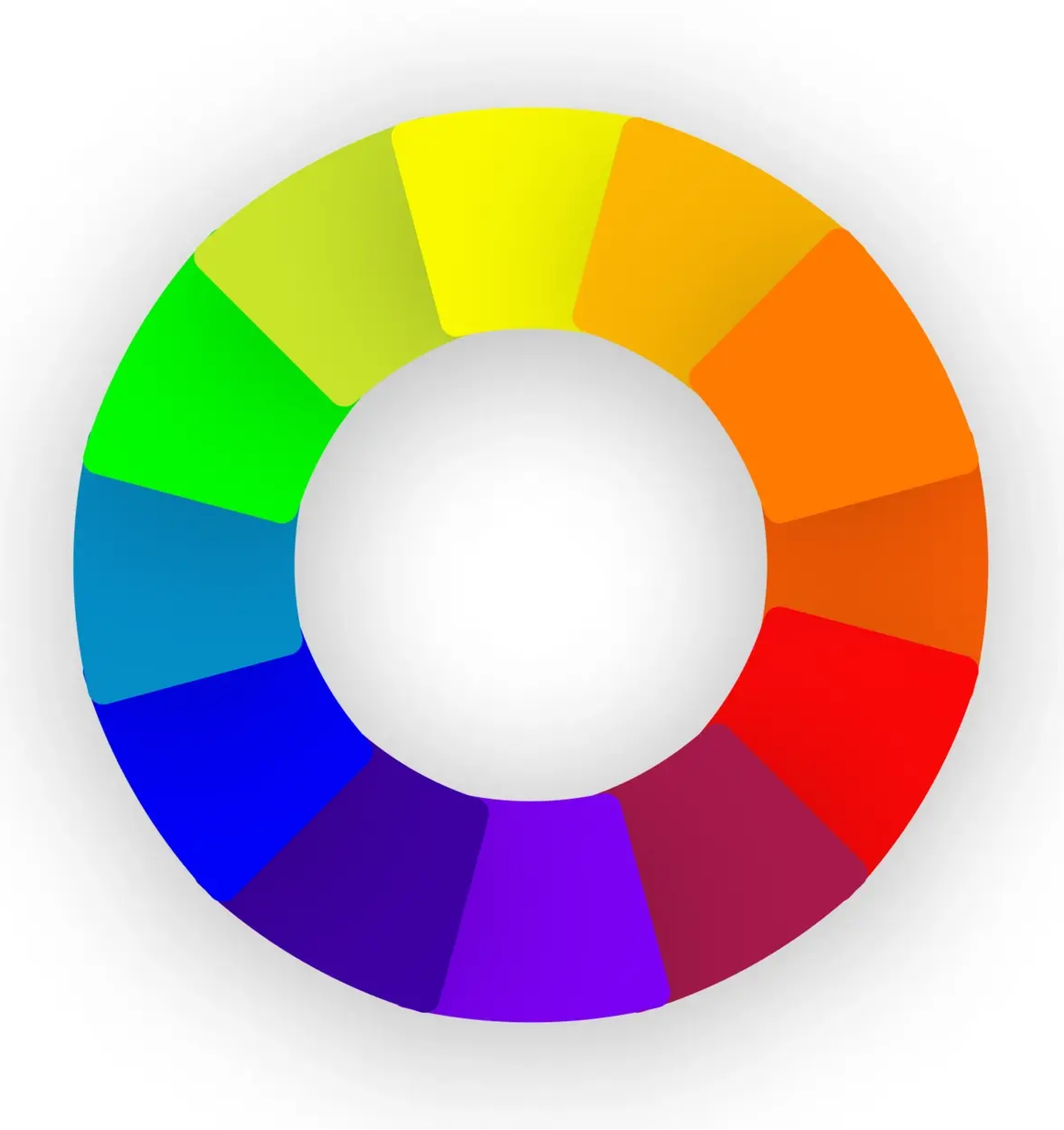
Yellow and blue (and green) are analogous colours, meaning they are next to each other on the colour wheel. By picking these colours, I created a softer and more harmonious colour palette reminiscent of nature, and suitable for the adjectives I wanted my brand to embody. I also chose an off-black and off-white to make it less harsh on users’ eyes.
Source: Figma


UI library >
Since my intended user base consists of older adults (60+), I wanted to make sure they were able to use my app as intended, regardless of any vision impairment. Using Stark Contrast Checker, I confirmed that I passed either WCAG AA or AAA standards. In the few cases where I didn’t, rest assured that it was purposely designed to be that way: I wanted to guide users through chapters sequentially, so later chapters appear faded (and thus don’t pass WCAG AA).
I designed this mobile app from scratch, so I know where everything goes and what they’re for. However, someone else isn’t going to know that, which is why a UI library is so important. I documented everything I used in the app, from the atoms (spacing, icons, buttons) to the organisms (carousels, menus) and templates.
7/ Prototype
hi-fi >
tablet visualization >
I considered how my users would use my app, and took note that apart from using it on mobile, they would likely also use it on a tablet.
Here is how my homepage would appear on an iPad, where there is more screen estate to show more topics.

8/ Promotion
desktop & mobile marketing site >
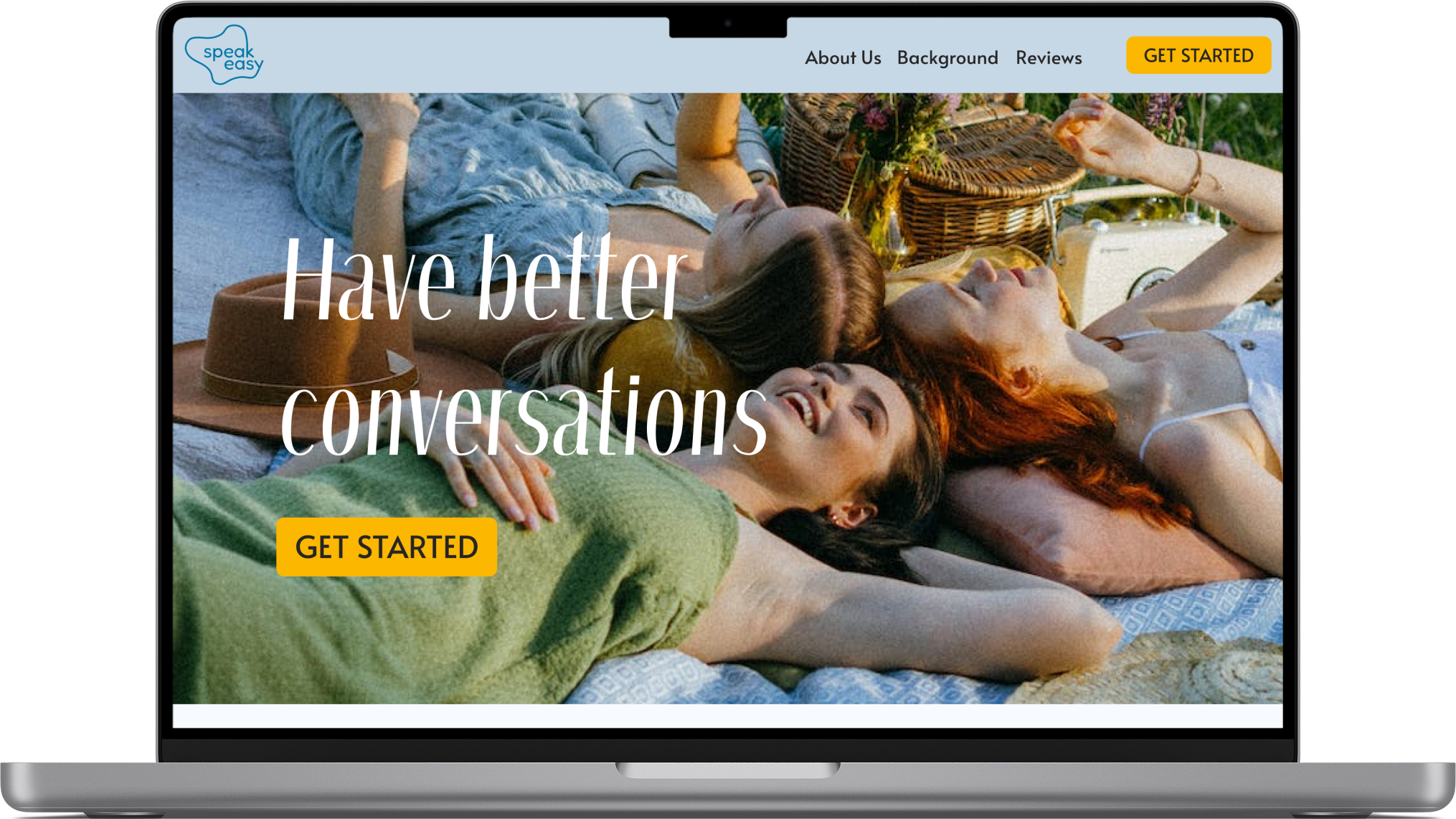

With Speakeasy ready to be soft launched, I created a marketing website for desktop and mobile viewports to reach a wider audience.
9/ Lessons
design impact >
learnings >
challenges >
next steps >
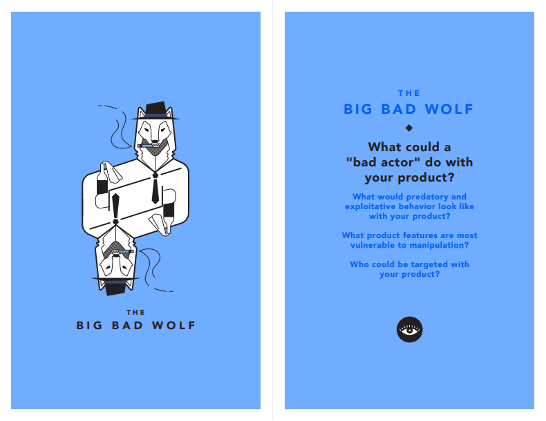
tarot cards of tech >
This capstone project taught me a lot about the design process. It’s crucial to know and understand the design tools we’re given to work with, but it’s also important to embrace ambiguity and the uncertainty of the process. But that’s what makes designing for users so much more rewarding :)
Although there are many other language apps out there (I’m sure you know exactly what I’m talking about), the benefit of Speakeasy is that it focuses on using audio clips to help users improve their pronunciation and participate in more fulfilling conversations by teaching them useful phrases.
I originally intended for my user base to be older, retired adults, so when I was designing, I had them (and my persona) forefront in my mind. They were the reasoning behind many design decisions, such as simple flows and meeting WCAG AA/AAA standards. By designing for this vulnerable population, I’ve made it even easier for users of all abilities to use my app.
In the beginning, it was difficult for me to understand the connection between different design tools and why we were using them. I felt demotivated because this was a problem I was excited about but didn’t know how to fix. After getting some help from my TAs, I was able to bounce back with greater insight.
I would like to incorporate additional features from user testing, including a functioning filter, notifications to remind users to practice, and allowing users to write notes. I also want to enable the ability to return and practice a previous recording. Of course, I also want to integrate more languages. The design process never ends; I also would like to perform more rounds of user testing to ensure user needs are continuously met.
-
Because my app requires users to allow microphone access on their devices, a bad wolf could potentially get their paws on these recordings and steal identities. To prevent this, I would need a robust security system.
-
Since my app doesn’t require users to input any personal information unless they want to make an account, currently the audio clips are most vulnerable. To ensure these are kept safe, I would use encryption so only the user themselves can access the recordings.
-
My intended user base consists of older adults who may be more prone to online scams. I want to make sure they feel safe using Speakeasy by including double authentication for a login flow and that any marketing material would remind them that Speakeasy would never ask for personal identifiable information.
That’s all folks!
That’s the end of my Speakeasy case study! Thank you so much for taking the time to go through it. Feel free to explore my other case studies or send me a message if you have any questions. 👋🏻