

Quick design challenge
BrainStation x PartnerStack
Redesigning Hackathon participation certificates for Code to Career students
Project Brief
timeline 🗓️
2 days
tools 📝
Figma
my role 👩🏻
Graphics
Presentation designer
0/ The Challenge
Design a participation certificate for Code to Career students at BrainStation to commemorate their recent hackathon
Certificate must contain both BrainStation and PartnerStack branded elements, including the logo
1/ The Constraints
While I had free reign on the look of the certificate, I had to follow the layout of the provided template.
As well, BrainStation and PartnerStack have proprietary branding elements that must be adhered to, including logos and colours, as below.
BrainStation


PartnerStack
COLOURS
LOGOS

ASSETS


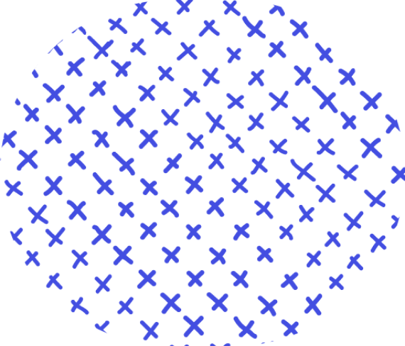


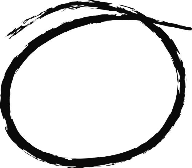
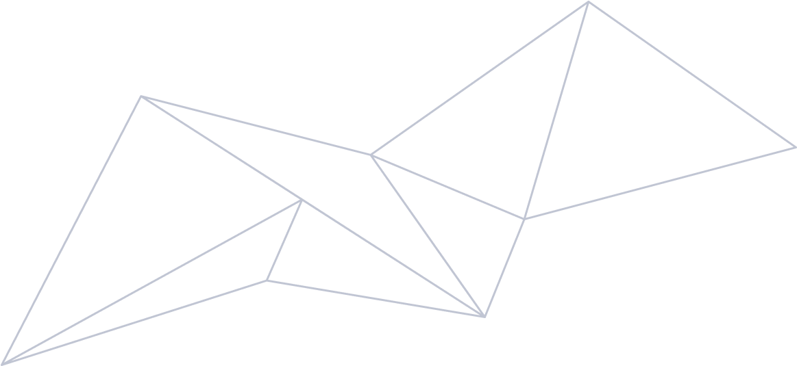
Note: While the two coloured elements are real PartnerStack branded elements, the other doodles were accessed through free Figma community files. PartnerStack uses raw, handmade shapes for their illustrations, so I strove to find hand-drawn visuals to align with their branding.
2/ The Certificates
With these constraints, I created eight iterations, each with different visuals that played upon BrainStation’s or PartnerStack’s unique branding.
Take a look below!
The original template
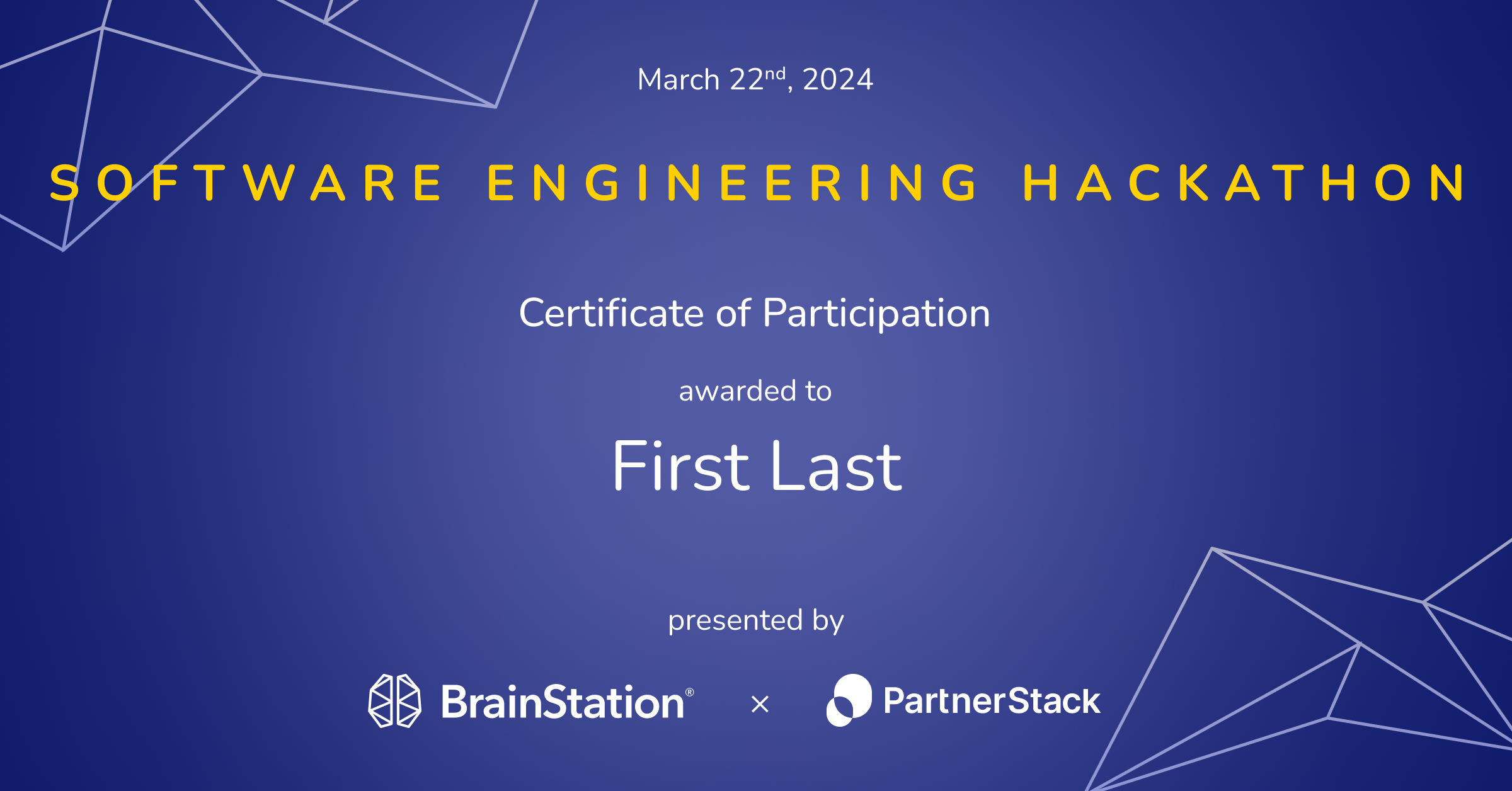
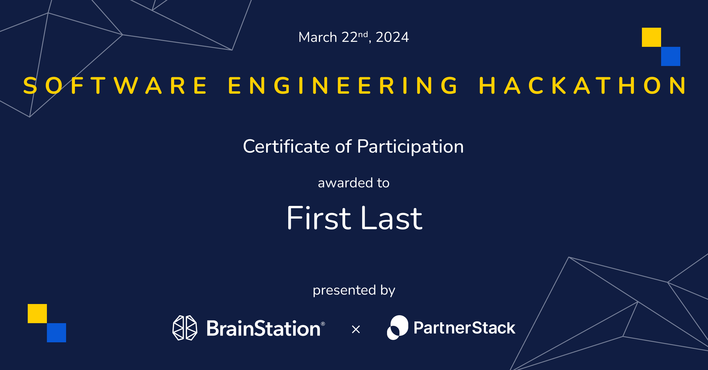
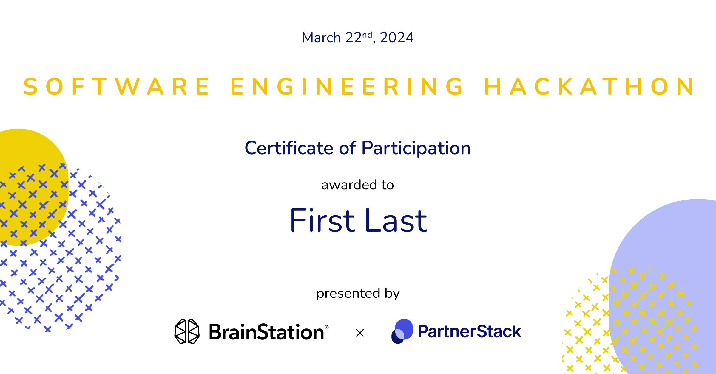
Dark: v.1
Dark: v.2
Dark: v.3

Dark: v.4
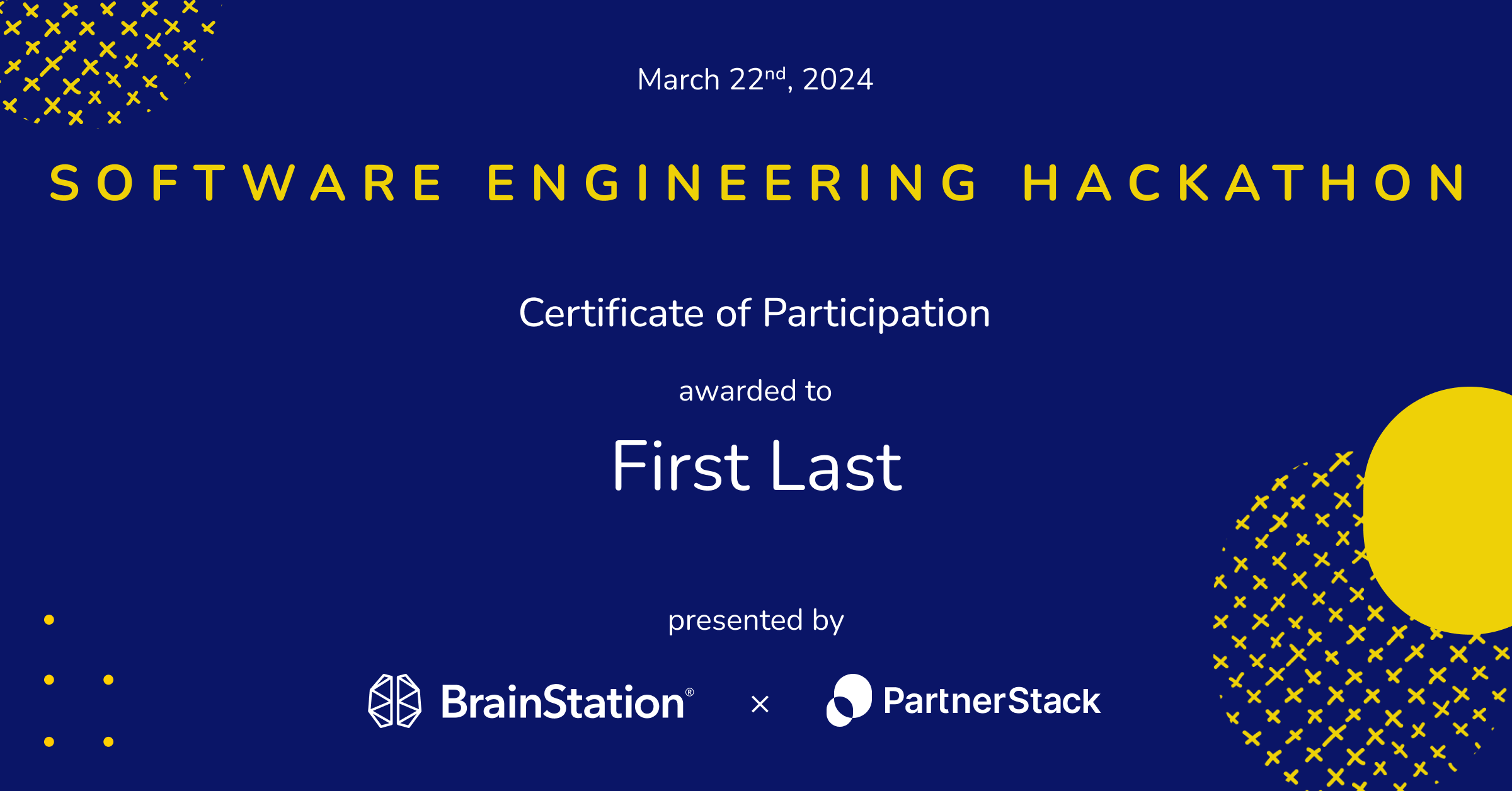
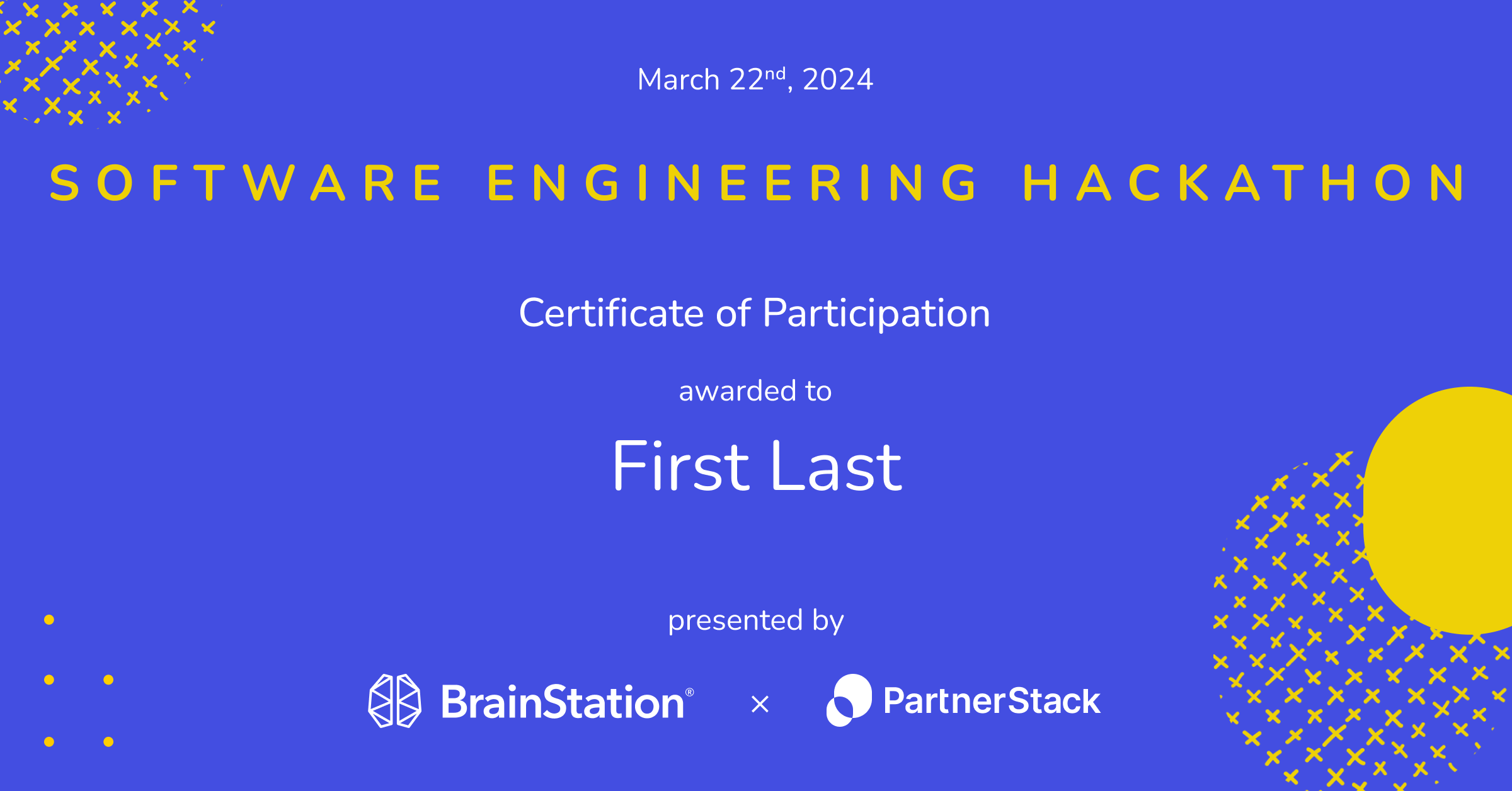
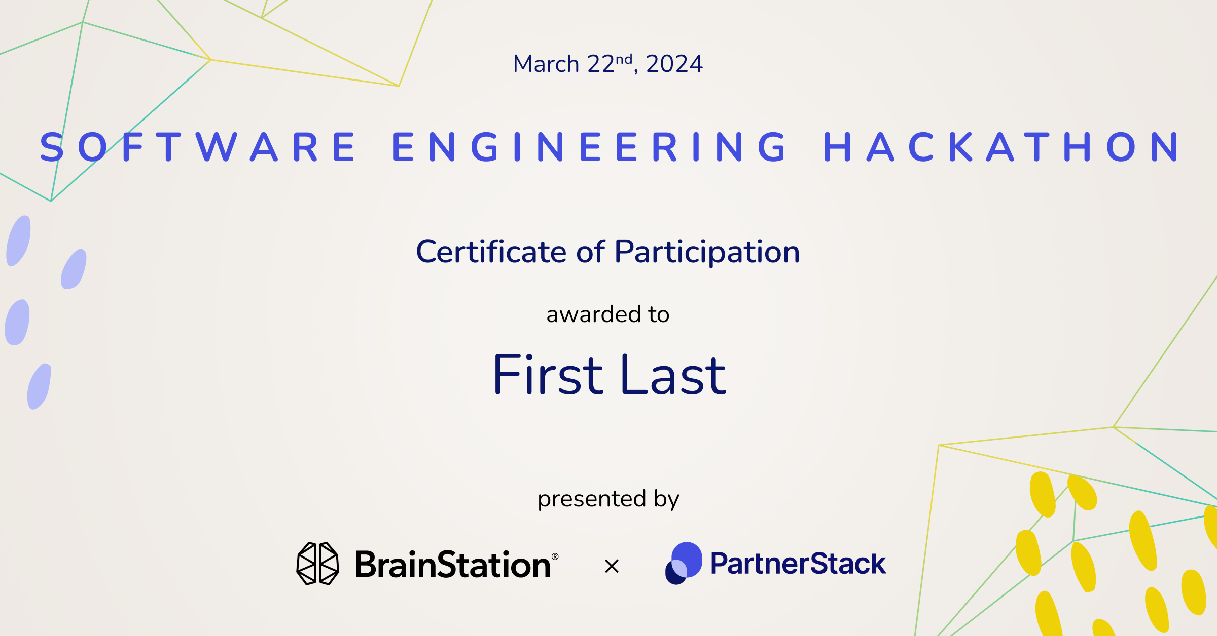
Light: v.1

Light: v.2
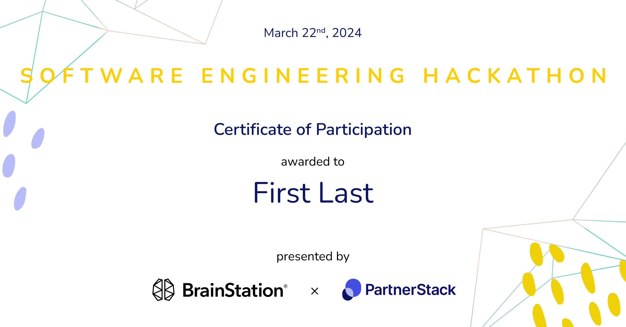
Light: v.3
Light: v.4
Light v.1 was chosen for its simple design highlighting PartnerStack’s primary colours and playing on their recognizable ellipsis logo for the graphic elements.
Congratulations Code to Career students on your successful hackathon!
That’s all folks!
That’s the end of my PartnerStack design challenge! Thank you so much for taking the time to go through it. Feel free to explore my other case studies or send me a message if you have any questions. 👋🏻